
Policy Experience Design
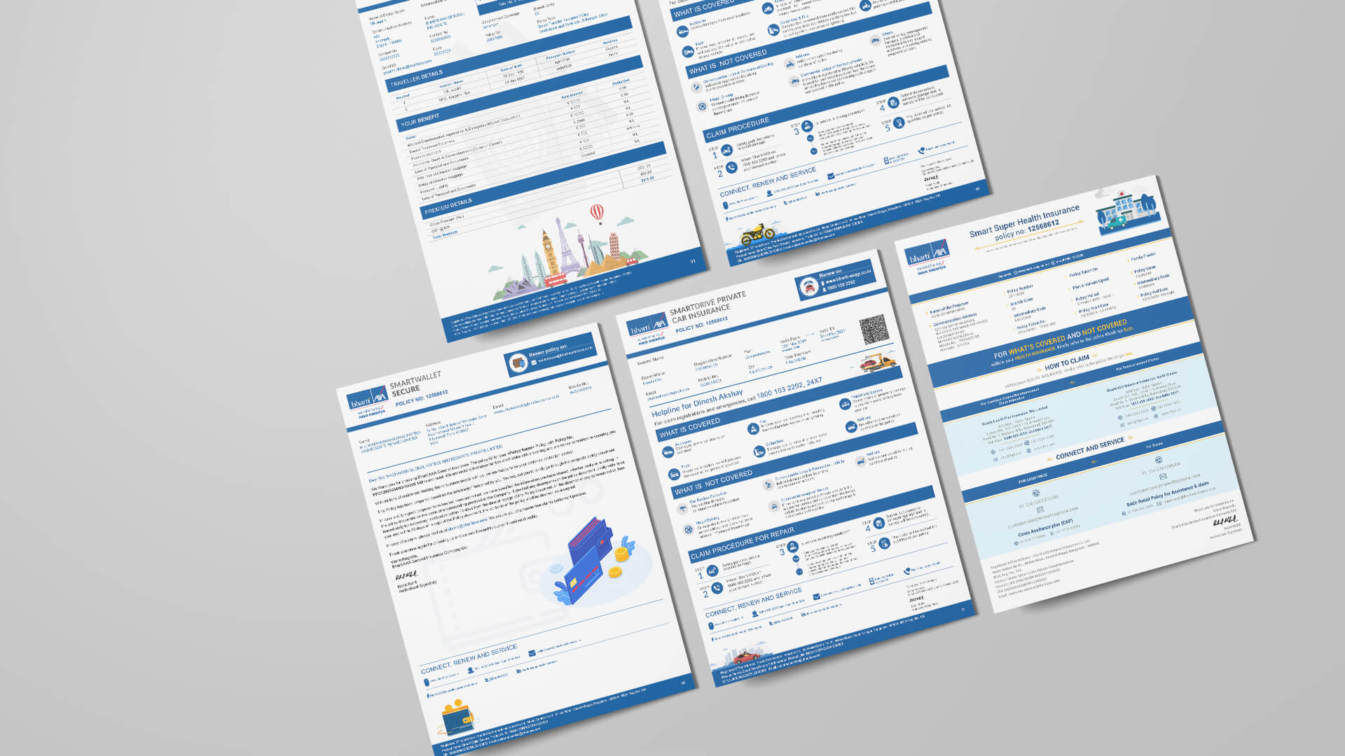
A portfolio-wide redesign of Bharti AXA's policy kits - simplifying insurance without oversimplifying the policy.
Redesigning insurance, one policy at a time.
One of the most important touchpoints in the customer journey is also the most ignored. Policy kits are traditionally dense, text-heavy, hard to navigate and filled with legal language most customers never fully read. Critical information is buried in fine print - creating confusion, service queries and a disconnect between what customers buy and what they believe they bought.
Bharti AXA recognised that while its products were evolving, the customer experience around policy communication had remained largely unchanged. The opportunity was simple: make insurance easier to understand.
Bharti AXA's portfolio spanned many categories, each with its own policy kit, welcome letter, disclosures, benefits, exclusions and legal requirements:
The challenge wasn't redesigning a single document. It was redesigning an entire ecosystem of customer communication while ensuring complete regulatory compliance.
How do you simplify insurance without oversimplifying the policy?
When information feels complicated, people stop engaging. When it feels accessible, trust increases. The goal was never to remove information - it was to make information easier to find, read and act upon.
We reimagined policy kits not as legal documents, but as customer experiences - each one built around a simple principle: help customers understand what they've bought, what is covered, what is not, and what to do next.
Complex policy information was reorganised into clear, intuitive sections so customers could quickly locate what matters.
The sections that matter most were prioritised through stronger structure and hierarchy:
Dense paragraphs were broken into digestible formats - section dividers, icons, tables, highlight panels and summary modules - making documents easy to scan.
Across every category, a common visual language created familiarity at every policy touchpoint.
The experience was simplified, but every mandatory legal, compliance and policy requirement remained fully intact.
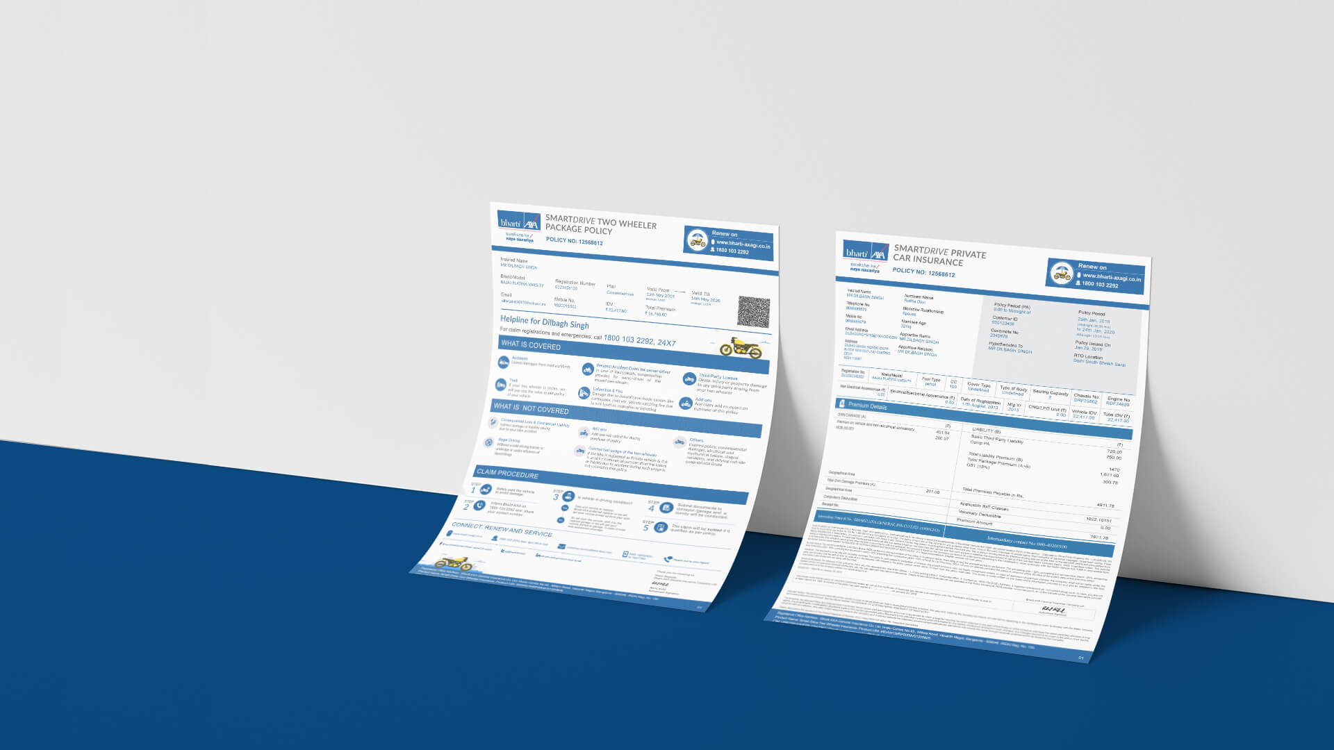
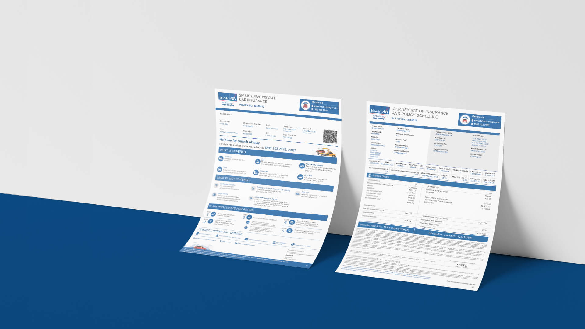
Policy documents became easier to navigate and understand.
Customers could quickly access the information relevant to them - without searching through extensive legal text.
Clearer communication bridged the gap between policy purchase and policy understanding.
More accessible information reinforced transparency and customer-centricity at a critical touchpoint.
The redesign established a framework that can extend across future products and policy categories.
These are the qualitative outcomes of the redesign, assessed against how customers read, navigate and act on their policy document.
By redesigning policy kits across its portfolio, Bharti AXA turned one of the most overlooked customer touchpoints into a clearer, simpler, more human experience. Because trust isn't built when a policy is sold - it's built when a customer finally understands what it means.
Writing the words inside a product or document so that people can act on them - labels, instructions, error messages, section headings. It treats language as interface, and is judged on whether the reader can complete the task, not on style.
Because a policy document is a legal contract, drafted for enforceability and regulatory compliance. Precision and precedent drive the wording, so clarity for the person reading it is rarely the first constraint on the page.
Keep the legal text intact and change how it is presented: structure the document around what the reader needs to know, surface key terms up front, place plain-language summaries alongside the clauses, and design the navigation so people can find their own answer quickly.