
BACKGROUND
Bridging dermatological expertise with everyday practicality.
Candid Activ is specifically engineered to combat sweat, odour, itching, and soreness. It serves as a vital bridge, combining rigorous clinical protection with the functional, high-performance requirements of an active daily routine.
THE CHALLENGE
Over-communicated claims creating clinical overload.
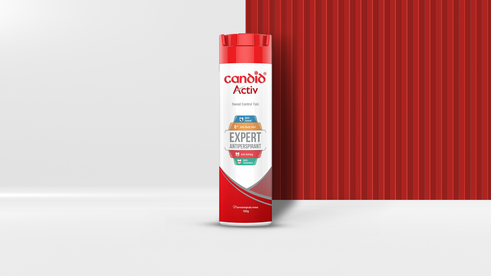
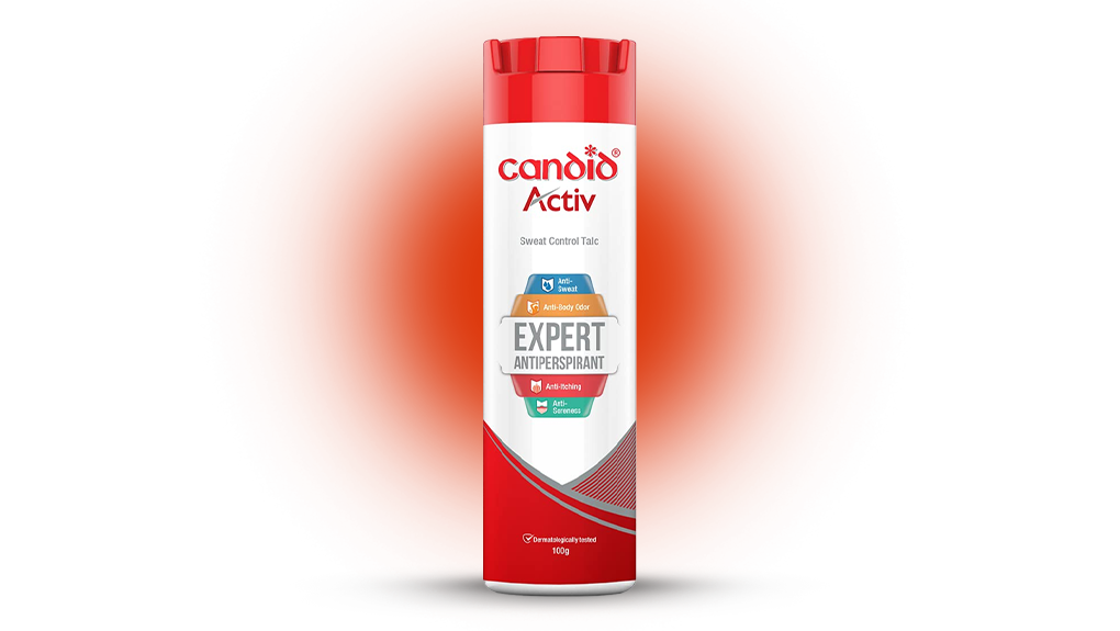
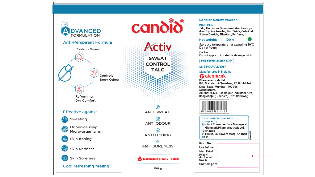
The earlier packaging attempted to communicate too much information all at once. Multiple badges, stacked text claims, and dominant callouts made the container look intensely cluttered and overly medicinal.
- Visual congestion due to competing product claims
- Multiple overlapping graphics and callouts
- An overly prescription-heavy feel that lacked lifestyle appeal
THE STRATEGIC IDEA
Consumers should immediately understand exactly what the product does and why it matters to their routine. By stripping away extraneous noise and placing focus purely on functional clarity, the pack transitions into a sharp performance essential.
THE DESIGN SOLUTION
Elevating clarity and performance through clean, structured modern architecture.
WHAT CHANGED
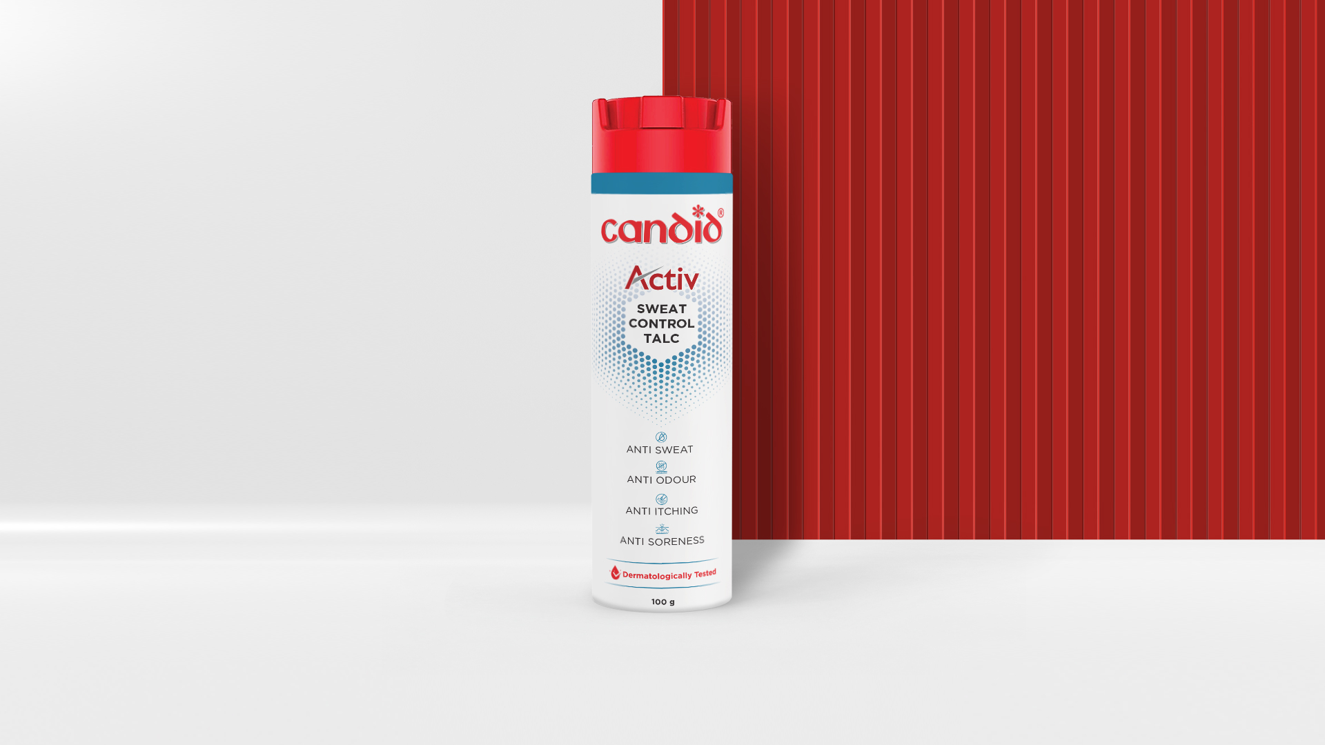
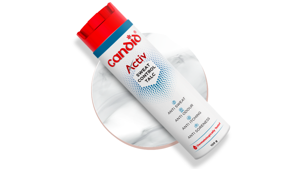
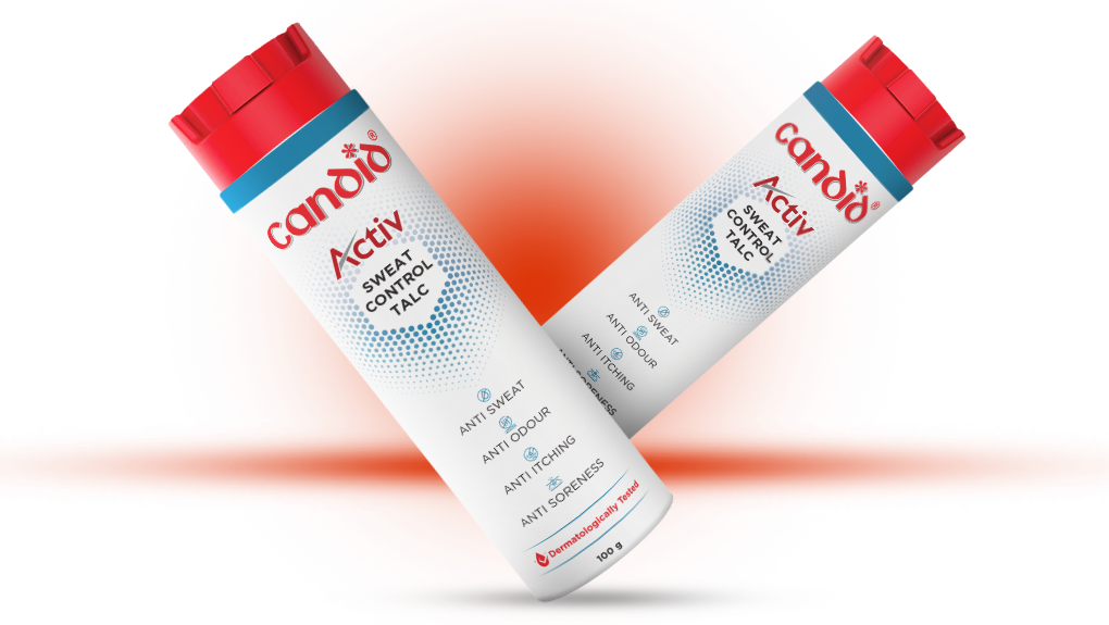
"Sweat Control Talc" Elevated
The absolute core function of the product was brought to the absolute top of the visual hierarchy, establishing immediate clarity and brand relevance on the first look.
Simplified Information Architecture
Secondary graphic badges, intersecting lines, and competing text callouts were systematically removed to allow the packaging to breathe naturally.
Clean Vertical Hierarchy
An aligned, elegant vertical hierarchy replaces the scattered blocks of the older generation, leading the consumer's eyes smoothly through benefits.
Dot-Fade Freshness Graphic
An active dot-fade aesthetic pattern was introduced to convey high-end performance, aeration, and lifestyle freshness, minimizing text reliance while boosting trust.
THE RESULT
A sharper, highly accessible balance of trust and relevance.
- Clarity That Performs: Reduced visual background noise lets the core high-performance utility step forward.
- Active Lifestyle Context: The visual identity aligns with modern fitness, athletic gear, and active hygiene expectations.
- Preserved Authority: Strikingly minimal architecture that proudly maintains underlying clinical confidence.
- Instant Navigation: Essential claims are neatly integrated without looking like a congested product leaflet.
CONCLUSION
By shifting from a crowded medicinal list to a refined, vertical layout emphasizing sweat defense, Candid Activ successfully transforms into an accessible, performance-driven daily essential.