
BACKGROUND
A trusted dermatologist-recommended sunscreen for acne-prone skin.
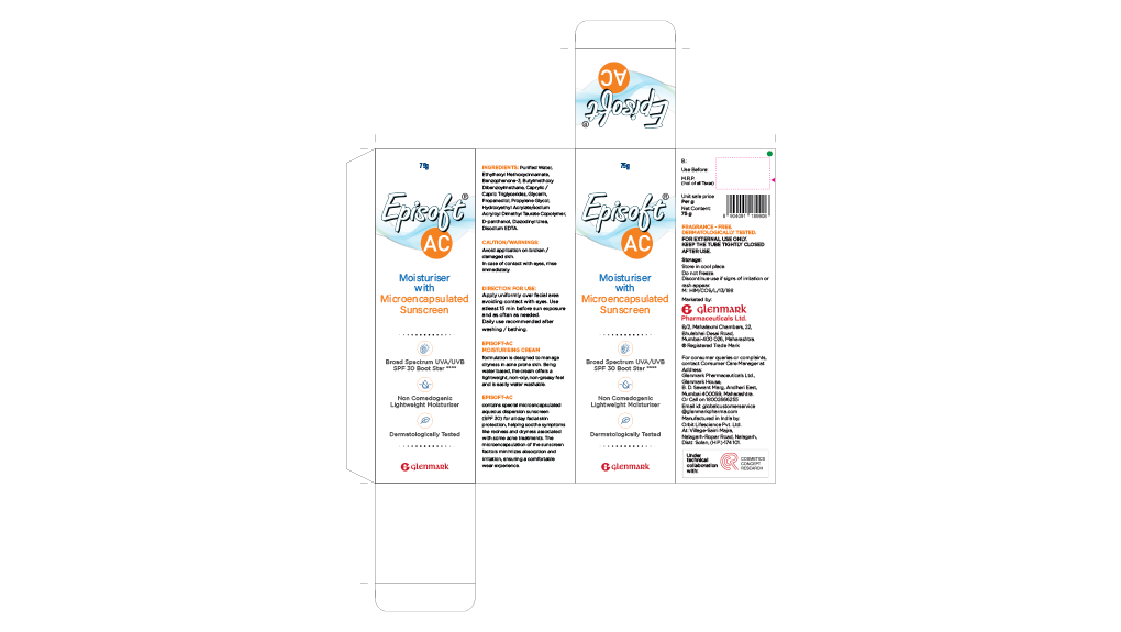
Episoft AC SPF 30 is Glenmark's gentle, hydrating broad-spectrum sunscreen — long recommended by dermatologists for sensitive and acne-prone skin, with genuine clinical credibility and a loyal, medically-guided user base.
THE CHALLENGE
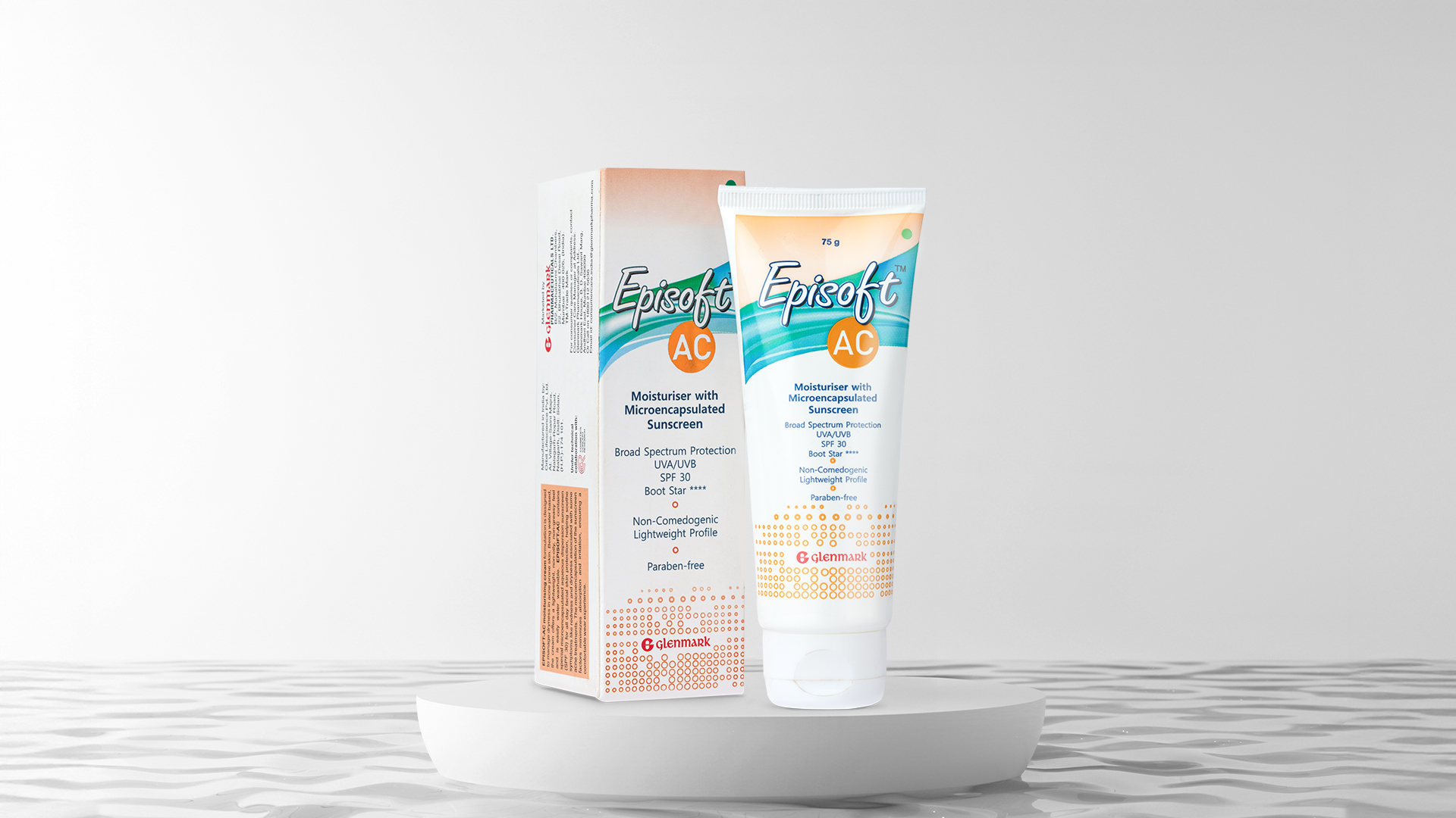
Clinical packaging in a category becoming cosmetic.
The existing pack felt dated and overly clinical. As consumers began viewing sunscreen as a daily skincare ritual rather than a prescription necessity, Episoft needed to evolve — without losing its medical credibility.
- Packaging that looked clinical rather than caring
- Minimal visual appeal in a fast-growing cosmetic category
- Failing to convey protection and gentleness simultaneously
THE STRATEGIC IDEA
The redesign sought to reflect the product's gentle efficacy — building consumer confidence not through clinical authority, but through approachability and care. The pack needed to feel like it belonged in a skincare routine, not just a prescription bag.
THE DESIGN SOLUTION
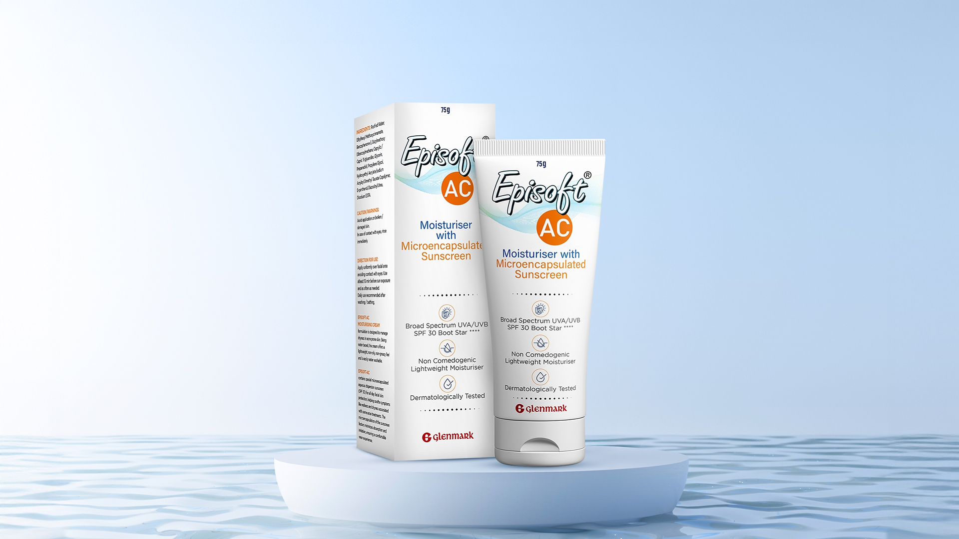
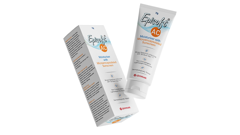
A redesign that mirrors the care the product delivers.
WHAT CHANGED
Palette & Tone
A bright, approachable white palette replaced the older, heavier clinical tones. The new colour language evokes cleanliness and everyday ease — skincare, not prescription.
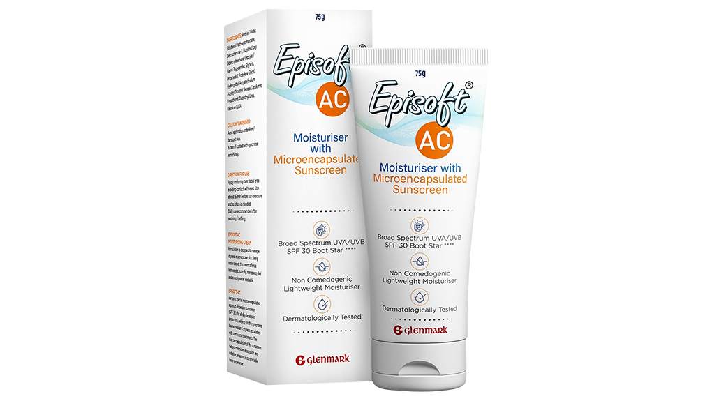
Hierarchy & Callouts
Improved visual hierarchy and benefit callouts now lead the packaging — making it immediately clear what the product does and who it's for. Broad-spectrum protection and sensitivity suitability are no longer buried.
Typography
Simplified typography strips away visual noise, creating a cleaner reading experience. Each element earns its place — the result feels considered rather than cluttered.
Visual Language
A lighter visual language across the pack makes it feel contemporary and user-friendly — while still evoking the trust that dermatologist-recommended products demand.
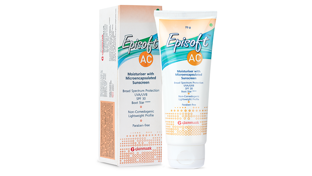
THE RESULT
Contemporary, trustworthy — and unmistakably Episoft.
- From Clinical to Confident: The pack now reads as a product that belongs in a daily skincare ritual, not just a dermatologist's prescription.
- Benefit Clarity: Broad-spectrum protection and sensitivity suitability are communicated at first glance.
- Maintained Credibility: Modern and approachable, yet the medical trust is preserved — the brand's core equity remains intact.
- Category Standout: Episoft now stands out without shouting — proof that even everyday essentials deserve design attention.
CONCLUSION
By shifting from clinical authority to gentle confidence, the redesign gave Episoft AC SPF 30 a new presence — one that earns trust not through intimidation, but through care. Because great design doesn't just communicate a product. It embodies its promise.